Showing posts with label Data. Show all posts

13 June 2012

SLAve to convention

Conventional FM wisdom tells us that we should manage our client/supplier relationships with SLAs, but maybe some of us would be better off ditching them altogether.

Service Level Agreements (SLAs for short) are an agreement between the customer and supplier about the extent, the quality or the speed with which a service is provided; 90% callout within 4-hours is a commonly used example.

In theory, SLAs are a way for the customer to make it clear to the supplier what standards they expect (that’s the Service Level part) and for the supplier to confirm that those standards can be delivered (that’s the Agreement part).  Measuring how well the SLA is achieved enables both parties to be clear about whether the service being provided is meeting expectations; this in turn helps the supplier to prioritise resources and actions to help ensure the customer gets what they wanted. That’s the theory anyway.

The trouble is; I don’t really buy into it. 

Stick to carrots

One of the big issues I have with SLAs is that they are often written into service agreements; effectively they become glorified “get out” clauses, to enable customers to terminate suppliers who fail to meet the mark.

Of course I’m not saying that having the flexibility to break of relations with a supplier who is seriously underperforming is a bad thing, but I wonder if the approach is a little short-sighted: human nature dictates that if you are going to give someone a stick to beat you with, you make that stick as small as possible. 

Does the use of SLAs actually encourage us to strive for mediocrity rather than success?  Remember that agreement part of the SLA?  Well it often seems to me that suppliers are reluctant to agree to SLAs that they couldn’t easily meet. For example, let’s go back to the 90% callout within 4-hours example cited at the beginning of this blog.  I work in Berkshire. I’d happily place a wager on the fact that in 4 hours, I could be in Swansea, Manchester, or maybe even France, but the SLA would have me believe that just getting to my office from their's (which probably isn't in Manchester by the way) in the same timeframe is some kind of indicator of successful service provision.........  So does that really drive performance in the way I’d like it to?


Not that suppliers get all the blame here.  Realistically, the service provider could probably manage 90% callout in 2-hours, but if the price of failure is losing the contract, you can’t really be suprised if they choose to play it safe. Perhaps the better approach is to prefer the carrot to the stick.  I suspect we prefered incentives to penalties, then service providers would be more willing to accept  challenging targets and this would drive better service. 
 

Sample size

One of the other concerns I have with SLAs is sample size.  SLA achievement data is supposed to be representative of the service performance, but for statistical data to be useful, it needs to come from a decent sized sample.

My career to date has always been in client-side (in-house) FM; I’m generally a buyer, rather than provider, of services. The supplier relationships I’ve had have been small in comparison to say, for example, large TFM relationships. The truth is, that in my area of operations, many of the standard issue SLAs fall down as a result of scale.

Let’s say, for example, my vending contractor offers me that 90% callout in 4-hours SLA.  Each month they report 100% success and everyone is happy because they get here so quickly?  Well not quite.

You see the reality is that the machines are quite new. The 100% success rate is actually telling me that they rarely break down, not that the supplier responds quickly. If the machines only break down once a month or so and the SLA is reported every month, there’s really only two ways it can go: 0% success or 100% success. Simply put, the volume of transactions is just too low for the SLA to be a useful indicator of success. Perhaps reporting it over a longer period (say a year) might be better, but I suspect that it would only really work over a much larger contract.

The other thing I really need to ask myself is, if they always get here in 4-hours anyway, should I really be focussing my energies on an element of the service that has room for improvement?

Choose wisely

Despite my opening statement, I’m not actually suggesting we all dispense with our SLAs, but I do think that both customers and suppliers need to give much more careful consideration to what their SLAs are doing for them if they want them to be effective.  Measure what is important to the relationship: use SLAs to drive positive success by measure the areas you want to improve. Don’t just measure what everyone else is measuring; don’t just be a SLAve to convention.


10 May 2012

Worth a thousand words?

Being good at communicating information to other people is an important skill for Facilities Managers. But when that information is actually quite complicated, communicating it isn’t always easy and a range of techniques needs to be used to ensure the message is delivered effectively.  At times like this I’m reminded of the old adage that one picture, is worth a thousand words.

Processing visual information


I always attend meetings with a notepad and four different, coloured pens. Whilst making notes, I tend to switch pens at random. The strange thing is, although I make notes, I almost never need to refer to them – which is quite fortunate really because my handwriting would put a doctor to shame. People often comment upon this (the coloured pens, not the handwriting) and ask me why. The explanation is quite simple: it’s a similar effect to the memory trick magicians use to remember the relative positions of cards in a deck. They’ll associate each card with a room in a house or different tube station, etc. In the same vein, I’m not so much remembering the information I write, as remembering what colour I wrote it in and where on the page it is written.  That’s because I, like most people, respond more readily to visual stimulation than other forms of communication.


As human beings, we have evolved to process visual information very quickly; Three million years ago it usually made the difference between getting lunch and being lunch. It’s a skill that has stayed with us and as a result the modern world is rich with visual content. From posters to television, from the internet to the apps on our mobile phones, we are very comfortable in getting our information in bright, shiny, primary colours and an effective communicator can take advantage of this principle to help them get their point across.

Understanding relationships

I first discovered the power of communicating information visually a couple of years ago. I was looking after an old building where the air-conditioning was in fairly poor order with a number of faults that needed to be addressed. The problem was exasperated by the fact that, what had been intended as an open plan space, had been subsequently partitioned without much consideration to the environmental systems. This had left Fan Coil Units spanning rooms and wall mounted controls serving units in other rooms.  It was a bit of a mess.To resolve the issue, we commissioned our maintenance company to do a full survey of several floors and come up with a cost for putting it right. The trouble was that even I hadn’t appreciated how much work needed doing. I ended up with a 90 page report (one for each fan coil) and a quote that made the director’s jaws hit the floor.
I was told I’d have to prioritise; do the greatest good first, and programme the rest for the following year. 


This left me with a bit of a dilemma – how to work out where money spent would deliver the greatest value? Fortunately, I had two sets of data I could draw upon to help me: I had quote (which I had asked the supplier to break down for me) and I also had some customer complaint data on a room-by-room basis that I could use as my justification. 


One slight complication though, was the whole open-plan/partitioning issue. Fixing a problem might involve working on more than one room at a time, so it wouldn’t be quite as simple as listing the rooms and listing the cost to fix them. Instead I decided to present the information visually. It looked something like this.


One of the ways using visual methods of communications excels over other forms, is the way in which it allows you to efficiently describe relationships. I colour coded the rooms on a simple traffic light system to show the complaint level and overlaid this with each of the pieces of work showing which areas they would impact and what the costs of that work would be. It took me two whole days to pick through the detail of half-a-dozen floors, but one meeting and ten minutes later, I’d managed to secure a lot more funding than I’d been led to believe was available. You see, seeing it in a visual format, allowed my stakeholders to relate to the data and to understand both the scale of the problem and what they would get for their money.

Visually interesting


Since that first success, I’ve experimented with a lot of different visual communications techniques. I’ll admit they can take a little time to prepare, but if they help get your message across and help you achieve the results you need, then that can be time well spent.
One of the things I’ve noticed is that visual communication can be extremely effective when you present your information in an unusual way. Especially if the way you communicate it helps people relate to what it is. If you can capture someone’s interest, the battle is already half-won. 


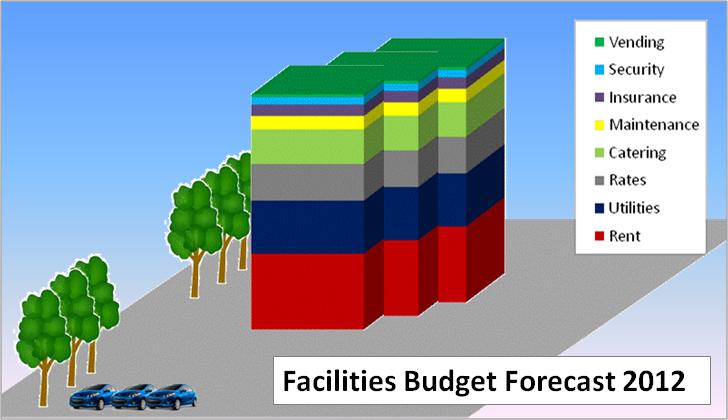
The graphic above is a recent favourite of mine.  At heart, it’s actually just a basic bar-graph of an FM budget, but to make it more interesting I’ve cut and pasted it together so that it looks like a building. To reinforce the message I’ve added a couple of trees and cars.  I really like the message that this gives, the fact that everything up to the first floor is the rent is something people can easily relate to without having to know the actual percentages or figures and if you can make it the same shape as your building, people will find it very easy to relate too.

The power of metaphor

I often find myself having to communicate information in stand-up presentations. I used to create very content-heavy PowerPoint slides to accompany my words when I did this, but that all changed when I saw what was probably, the best presentation of my life: It had no words, just three different pictures of dogs.  The speaker pulled up each picture in turn and explained why they were a metaphor for what his department was doing. It was something I’d never seen before and I was immediately sold.


Recently, I used this image in a similar fashion.  I told my assembled industry colleagues that I thought it was the perfect metaphor for Facilities Management: lonely at times, challenging, exhausting, but ultimately, incredibly satisfying and personally rewarding. The whole room nodded in unison.

Don’t tell me, show me.

So next time you need to communicate something complicated to a customer or stakeholder, spare some consideration for using a visual communications method: Remember, one picture really can be worth a thousand words.
 

12 October 2011

Lies, damn lies & metrics.

I'm told that if you measure it, you can manage it. I'm not sure that’s entirely true, but I have been a big fan of collecting data for quite some time.  Recently I've been wondering if I can make those numbers work harder for me.

I suppose the moment of truth came a few months ago during a business update presentation.  I work for a huge business, which has interests in all sorts of different markets in different areas of the globe. The update could have taken hours to run through, but the information had been condensed down onto just two PowerPoint slides.  Admittedly the slides were busy, but even so it was an impressive example of getting to the point. Vast sums of money and hours of activity boiled down to a few simple numbers which indicated how the performance of different areas compared both to the forecast and the previous period. 

This set me thinking; what is the real value of my metrics?  What do actually they mean to others?

I first started collecting data on my departmental activities to get a sense of the scale of the work being carried out. Being new into the job, I wanted to gain a better understanding of the volume of transactions, requests and complaints. The data has been very useful and has helped to inform and educate our customers as well as provide evidence that can be used to support our claims and refute misconceptions. 

It's was all very useful stuff and I was generally quite happy with how my numbers were performing until one day I noticed that they had started to turn on me.

It all started out, as it so often does in this line of work, with a sunny morning and a tripped out air handling unit. A few days later it happened again.

For several months I'd been very pleased to report a gradual decrease in the volume of issues logged about the comfort cooling as my engineers and I had gradually learned more about how to best squeeze performance out of the systems.  Suddenly, two unexpected events had thrown that out of the window.
On paper, August looked dreadful; an architectural monstrosity that blemished the otherwise tranquil skyline of my bar chart. I felt cheated.  Yes it had happened, but it was a freak event, the data wasn't really reflective of the real story.  It was then that I realised I needed a new metric.


This graph shows the number of issues logged over the course of the year to date

That was the day I stopped focusing on the volume of issues logged and started focusing on the volume of satisfaction instead. It sounds like much the same thing, but it's not.  Rather than reporting the number of people that said they were unhappy in a given month, I started looking at more positive metrics instead.  One of my current favorite metrics, is the percentage of working days where no one logs a complaint.  It doesn't matter too much if the chiller breaks down one day a month causing a spike of calls, the positive message is that for the other 19 days of the month, nobody called.  You can choose to report that as 10 complaints or 95% compliance. 

This graph shows the same set of data, but presented as the percentage of complaint free days

Sometimes I like to combine the compliance metric with a qualifier, to improve it further. You could argue that because people vary in their perceptibility to heat and cold, that one swallow does not a summer make. You could choose to set a threshold level to make the metric work harder; if you ignore those instances when only a single person feels too cold, you could get a better picture of just how often the system really fails to perform.

Some people might see this as "spinning the facts", but as long as you present your data with integrity and are very clear about what your metrics really mean, they will generally be well received; especially if you are prepared to explain why you have chosen to measure in that way. After all, the real value in metrics for the customer, is in comparing how you are doing, with how you were doing and how you hoped to do.

One last thought about metrics, is that there is one that set of data you should always record. In FM, thank you's can be few and far between; make sure you record every single one so that you can look back on them with pride during difficult days.