Processing visual information
I always attend meetings with a notepad and four different, coloured pens. Whilst making notes, I tend to switch pens at random. The strange thing is, although I make notes, I almost never need to refer to them – which is quite fortunate really because my handwriting would put a doctor to shame. People often comment upon this (the coloured pens, not the handwriting) and ask me why. The explanation is quite simple: it’s a similar effect to the memory trick magicians use to remember the relative positions of cards in a deck. They’ll associate each card with a room in a house or different tube station, etc. In the same vein, I’m not so much remembering the information I write, as remembering what colour I wrote it in and where on the page it is written. That’s because I, like most people, respond more readily to visual stimulation than other forms of communication.

As human beings, we have evolved to process visual information very quickly; Three million years ago it usually made the difference between getting lunch and being lunch. It’s a skill that has stayed with us and as a result the modern world is rich with visual content. From posters to television, from the internet to the apps on our mobile phones, we are very comfortable in getting our information in bright, shiny, primary colours and an effective communicator can take advantage of this principle to help them get their point across.
Understanding relationships
I first discovered the power of communicating information visually a couple of years ago. I was looking after an old building where the air-conditioning was in fairly poor order with a number of faults that needed to be addressed. The problem was exasperated by the fact that, what had been intended as an open plan space, had been subsequently partitioned without much consideration to the environmental systems. This had left Fan Coil Units spanning rooms and wall mounted controls serving units in other rooms. It was a bit of a mess.To resolve the issue, we commissioned our maintenance company to do a full survey of several floors and come up with a cost for putting it right. The trouble was that even I hadn’t appreciated how much work needed doing. I ended up with a 90 page report (one for each fan coil) and a quote that made the director’s jaws hit the floor.
I was told I’d have to prioritise; do the greatest good first, and programme the rest for the following year.
This left me with a bit of a dilemma – how to work out where money spent would deliver the greatest value? Fortunately, I had two sets of data I could draw upon to help me: I had quote (which I had asked the supplier to break down for me) and I also had some customer complaint data on a room-by-room basis that I could use as my justification.
One slight complication though, was the whole open-plan/partitioning issue. Fixing a problem might involve working on more than one room at a time, so it wouldn’t be quite as simple as listing the rooms and listing the cost to fix them. Instead I decided to present the information visually. It looked something like this.

Visually interesting
Since that first success, I’ve experimented with a lot of different visual communications techniques. I’ll admit they can take a little time to prepare, but if they help get your message across and help you achieve the results you need, then that can be time well spent.
One of the things I’ve noticed is that visual communication can be extremely effective when you present your information in an unusual way. Especially if the way you communicate it helps people relate to what it is. If you can capture someone’s interest, the battle is already half-won.
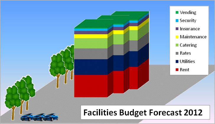
The graphic above is a recent favourite of mine. At heart, it’s actually just a basic bar-graph of an FM budget, but to make it more interesting I’ve cut and pasted it together so that it looks like a building. To reinforce the message I’ve added a couple of trees and cars. I really like the message that this gives, the fact that everything up to the first floor is the rent is something people can easily relate to without having to know the actual percentages or figures and if you can make it the same shape as your building, people will find it very easy to relate too.
The power of metaphor
I often find myself having to communicate information in stand-up presentations. I used to create very content-heavy PowerPoint slides to accompany my words when I did this, but that all changed when I saw what was probably, the best presentation of my life: It had no words, just three different pictures of dogs. The speaker pulled up each picture in turn and explained why they were a metaphor for what his department was doing. It was something I’d never seen before and I was immediately sold.

Recently, I used this image in a similar fashion. I told my assembled industry colleagues that I thought it was the perfect metaphor for Facilities Management: lonely at times, challenging, exhausting, but ultimately, incredibly satisfying and personally rewarding. The whole room nodded in unison.
Don’t tell me, show me.
So next time you need to communicate something complicated to a customer or stakeholder, spare some consideration for using a visual communications method: Remember, one picture really can be worth a thousand words.